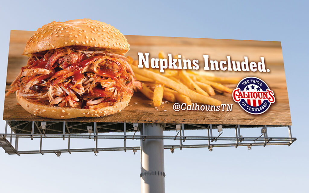
 4 Things NOT to Do on a Billboard Design
Thinking of buying billboard space? Perhaps on your commute, you saw a new sign listed as “available.” Or maybe your team has been discussing adding a new touchpoint with consumers, and you’re thinking of something (literally) big and bold.Whatever has prompted you to ponder this avenue of traditional marketing right now, you want your billboard design to make an impact. To help make sure it’s a positive one, we’re here to share what NOT to do when designing a billboard.
Billboard Design “No-Nos”
As one piece of your advertising strategy, billboard marketing can be a great way to increase awareness. The goal is not necessarily to make a sale, but to add another marketing channel as part of a comprehensive campaign. That way, when your audience sees your brand later, it already feels familiar.
An effective billboard design is clear, concise, and creative enough to capture and hold attention in just a few seconds. Simple, right? Just make sure to avoid these “design no-nos” we often share with clients…
Pitfall #1: Overcrowding your billboard space
Yes, a billboard is big, but it’s not as much real estate as you think. Unless people are stuck in stop-and-go traffic, typically your audience will only have a few seconds to view your sign — and usually from far away.
Here are a few specific strategies to avoid overcrowding:
- Don’t try to fill the whole space — empty space is just as important as what’s filled!
- Use minimal, yet powerful, words
- Keep images simple and striking
Pitfall #2: Getting too “fancy”
In the end, the ideal billboard will be deceptively simple. Which is to say, your team will invest a lot of thought and creativity into the design, but to your audience, the end result should appear pleasantly simple: clear and compelling messaging (including with a strong call to action) with a bold, clean design. Include your contact info, and be direct and clear in as few words as possible.
Readability is also key. This means that in most cases, you’ll want:
- Large, easy-to-read type (avoid narrow fonts)
- Effective spacing
- Simple language
- Minimal or no slang
Pitfall #3: Excluding people (accidentally)
Of course, your brand has a target audience. While understanding that target, you should still seek to be as inclusive and broad as possible. For example:
- Use an inviting, inclusive tone
- Use inclusive pronouns like “you” and “we”
- For images, include visible diversity: people of different races, genders, and with differing levels of ability, for example
Pitfall #4: Keeping it “all business”
We’ve focused a lot on keeping your billboard design simple and using clear and concise language. However, don’t let that make your messaging stiff, dry, or cold. Aim to use personable language and emotional pull, if you can.
Your billboard will be much more memorable, and your brand viewed more favorably, if your messaging appeals to people’s hearts, not just their minds and wallets.
The Big Picture: Helping Your Brand Thrive
Billboard advertising is considered traditional marketing (i.e. print, TV, radio, etc. — non-digital advertising) and, as we mentioned, it serves as just one touchpoint with your audience.
Here at Asen, we’re a full-service agency that leverages traditional and digital marketing in tandem to help our partners grow and thrive. Our services include everything from market research to branding, social media to websites, video to ecommerce, and more.
So, if you’re ready to grow your brand and would like to chat about how Asen can help, we’d love to hear from you!