Is it time for an updated logo?
Your logo is essentially the face of your company. It’s meant to reflect your brand identity, establish trust with your customers, and differentiate you from competitors. It can look intricate and modern, like the well-known Starbucks logo, or classically simple, like Apple’s. It can be bright and attention-grabbing, like Google’s, or abstract, like the famous Nike Swoosh.
When designed and used effectively, logos serve as a critical branding element that improves consumer recall and establishes who you are as a brand.
Companies often find themselves wondering if a new logo will help them reach new heights within their industry. This article will guide you in your decision to update your logo (or not) and provide helpful tips to ensure any change you make truly benefits your brand.
Start by looking at your industry and customer base
Before making this decision, it’s important to understand which aspects of your logo should change and which shouldn’t. The size and demographics of your customer base, their loyalty to your brand, and the industry you work in can all play a significant role in determining whether or not an update is necessary. The general rule of thumb is: you shouldn’t change any aspect of your logo that your customers would consider a main identifier of your brand.
For example, Nike has updated their font and inverted their colors in the past, but the swoosh has always remained the same (because it’s their key identifier).

Similarly, Adidas has made consistent changes to their logo over the years, but the use of three stripes and a singular typeface has remained constant.

However, most of us aren’t working for companies like Nike or Adidas. Most companies are smaller, less widely-known, and hold smaller portions of market share. This means that their logos are more flexible to change. The goal is to create a logo that can appeal to new potential customers, while also not losing any market share (i.e. your current customers). A change in typeface on your wordmark, creating an icon to supplement your wordmark, altering your color or tagline, or doing a combination of these may be just what your brand needs to grab more attention and improve consumer recall.
Does your logo match the company’s evolution?
Your logo shouldn’t make people feel like they’ve traveled back in time, unless that’s the purpose of your brand. If your logo feels at all outdated, it’s likely negatively impacting your business by leading consumers to believe you’re falling behind in your industry. It’s a simple principle that people are attracted to things that look new — which means your logo should make people feel like your company is the one for them right now.
Keep in mind that your logo should also speak to your current strengths, mission, and overall look. Consider whether your logo matches the evolution of your company, or your company’s progress has outgrown the logo.
Is a big change coming for your brand?
Before making a big “push” in terms of advertising, remember that you’re paying for your current logo to be seen and easily recalled. If necessary, this would be a good time to upgrade to a logo that will perform better and leave a stronger, lasting impression. If you’re planning on rebranding or changing the way your company is presented to your audience, consider polishing up your logo as part of the process. Brushing up your logo every five years or so is often considered best practice for keeping things fresh.
Things to consider when making a logo change
Even if you’re not a graphic designer, understanding the basics of logo design can help you pinpoint the best (and not-so-great) aspects about your logo and help you decide what to do with it moving forward. Here are some important considerations to note:
Simplicity is key
Logos are meant to be remembered. Throughout history, the simplest logos tend to be the most memorable and iconic. Using a logo that involves complex illustrations may make it more difficult for customers to recall who you are or what you do.
Text matters
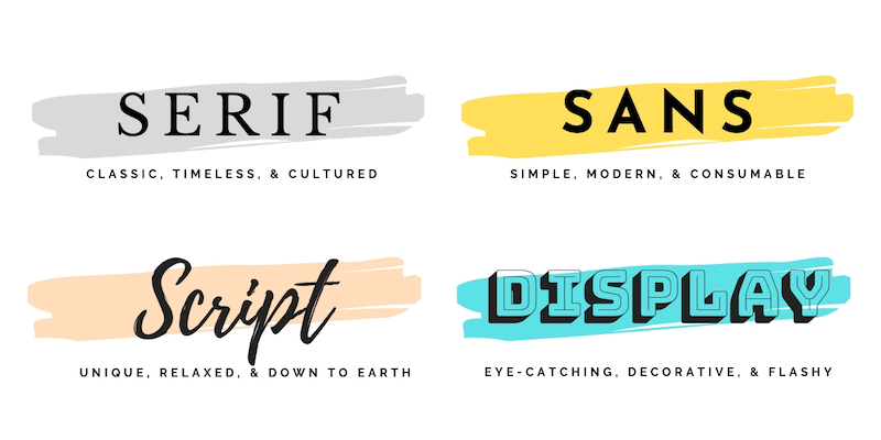
Typeface plays a big role with the impression a logo makes on a consumer. Choosing a font that evokes the right emotion is essential in getting your customers to feel and respond the way you want them to. Since there are endless typefaces across the web, deciding on the best category is a good first step in narrowing down your options. Check out the sample chart below and decide which typeface category you feel would best resonate with your customer base:

Make it versatile
Your logo should be designed with versatility in mind. Your logo acts as both the introduction and exclamation mark for your brand, and should fit each role appropriately. This means that it should speak to your brand’s messaging without much further explanation.
What about color?
Black and white logos often give off a strong, sophisticated, or classic feel, and if positioned correctly, can be more eye-catching and impactful than a colored logo. However, the human eye is naturally drawn to pops of color, making those logos more effective for many small to mid-sized businesses. A simple Google search can tell you a lot about the psychology behind color usage.
A good logo + ineffective marketing = bad results
If you take anything away from this article, let it be this: Today’s top brands didn’t get to where they are because of a spectacular logo; they got there with the help of marketing that made their logos feel spectacular in consumers’ eyes.
Authored by Brookney Chamberlain, Managing Partner and Creative Director at Asen. With nearly two decades at Asen, Brookney has led impactful logo redesigns, crafting versatile, memorable brand identities that align with company evolution, resonate with target audiences, and enhance consumer recall for sustained market success.
