As consumers, we’re naturally attracted to the many different colors around us.
But as marketers, we’re given opportunities to capitalize on that attraction to appeal to customers. It’s called color psychology, and it directly impacts most of the purchases you, your friends, and strangers across the world make on a daily basis. Understanding it will not only help you better resonate with your customers, but also drive long-term recognition and sales for your brand.
Up to 90% of customer impulses are based on color.
Here’s the thing: brand colors count in the grand scheme of things. Not all business owners and brand managers may realize it, but ALL of them are affected by it.
From cereal boxes to commercials on your TV screen, color psychology is one of the most effective ways to evoke emotion (right up there with video marketing). Why? Because of its ability to subconsciously produce purposeful thoughts and feelings within audience segments.
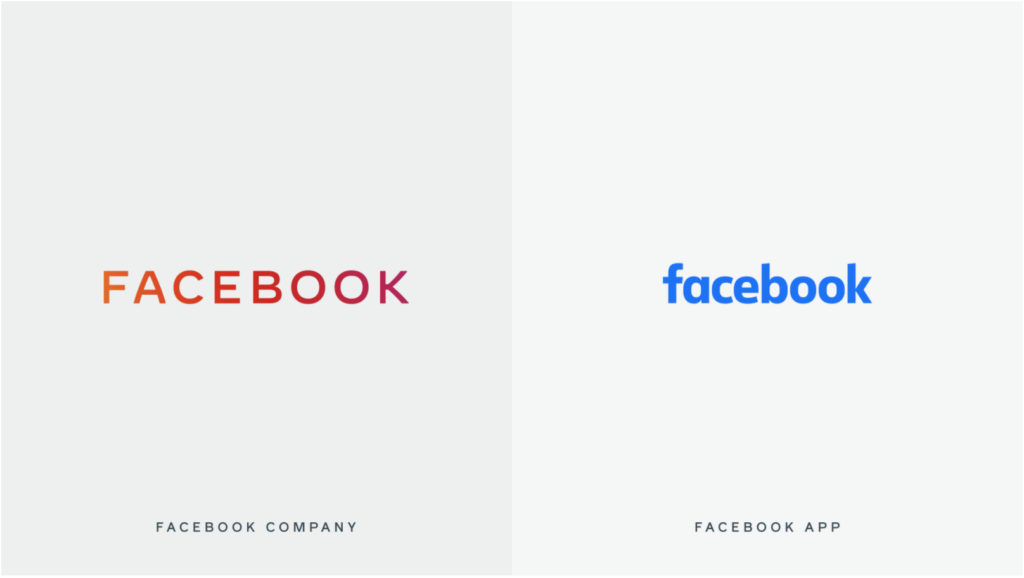
Facebook’s new corporate logo utilizes color psychology.
Recently, the world’s leading social networking site underwent a brand upgrade in order to visually show users that they offer more than just the Facebook app. After acquiring popular apps like Instagram and WhatsApp, Facebook went on to clarify its ownership of these other platforms by attributing unique colors to each business in its house of brands.

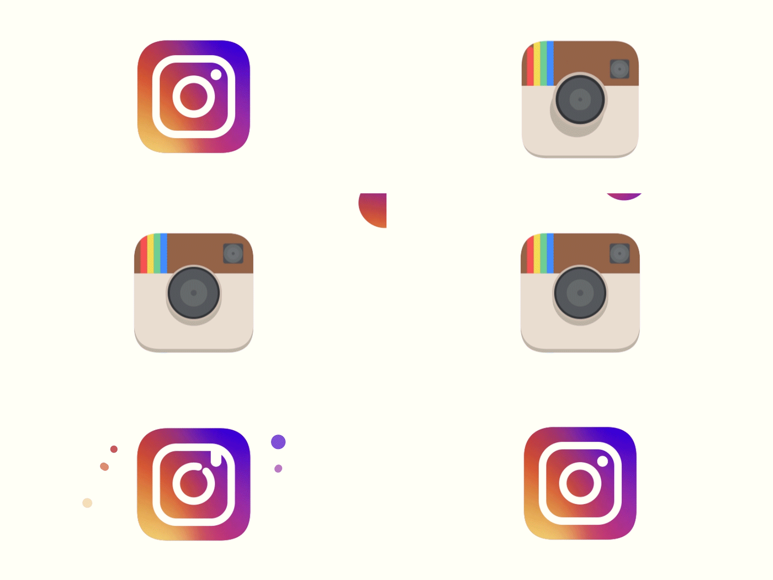
For Instagram, one of the company’s more profitable platforms, this meant a brand new look altogether. Since more than half (56.1%) of daily active users on Instagram are between 18 and 34 years old, Facebook knew that upgrading to a flat gradient of pinks, purples, and oranges— colors that represent life, youth, and energy— would appeal more to younger audiences than the previous brown, vintage look. How did they know? Consumer research on color psychology.

How consumers connect to the primary colors.
Even if you can’t quite put your finger on why, you associate certain colors and brands with distinct feelings. This concept is so intriguing to competitive marketers and business owners that thousands of studies have been conducted on the topic over the years.
Research shows many consumers connect shades of red with intense emotions like love, rage, passion, strength, and danger. According to Color Psychology, a popular online resource for understanding our connections to colors, it’s the most intense of them all. In marketing, this is perfect for attracting attention (the way a bright red stop sign does) or evoking an impulse to buy (the way online shopping sites do around Christmas).
Yellows, on the other hand, are bright and full of life. Consumer research shows that many people today associate shades of this color with joy, light, hope, and friendliness. Though it can also be associated with a few negative emotions, such as caution and anxiety, studies show the direct link to feelings of happiness comes from its ability to boost your energy and mental awareness.
The final primary color, blues tend to represent calming feelings, such as serenity and reliability. But deep shades of it can also represent sad emotions, such as loneliness and fear. You may have noticed that children’s goods are often full of bright cheerful shades of blue, while adult goods skew darker. This applies to most colors, and it’s because of color psychology.
Authored by Brookney Chamberlain, Managing Partner and Creative Director at Asen. With nearly two decades at Asen, Brookney has leveraged color psychology to craft visually compelling brand identities, strategically selecting colors to evoke targeted emotions, enhance customer engagement, and drive long-term brand recognition and sales.
