
Services
-
Brand Development
-
Logo Design
-
Marketing Strategy
-
Photo
-
Print Collateral
Archway Counseling A Brand Built for Impact
Dr. Maggie Klotz sought a unique brand identity for her counseling business, Knoxville Counseling & Psychological Services, to distinguish it in a competitive local and national market. Our objective was to help the small business owner uncover her new identity and build a brand that’s inclusive, approachable, and calming.
The Brief
Working with Dr. Klotz to learn more about her audience, services, and business goals, our team gathered insight before diving into the brand development process. From there, our task was to collaboratively develop a fresh brand that speaks directly to Dr. Klotz and her patients’ stories while prioritizing universal brand elements and language.
The new brand identity, Archway Counseling, does just that. By definition, an arch is an extension from one point to another, symbolizing progress and support at every turn. As a name, Archway Counseling serves as a reminder to clients that there’s no right or wrong way to move through life. Healing and progression aren’t linear processes. On a personal level, “Archie” is also the name of Maggie’s first born, giving deeper meaning to her brand’s story.



The Solution
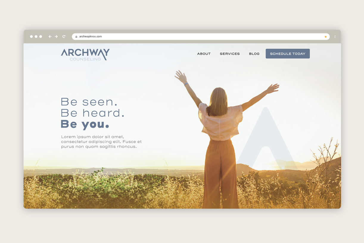
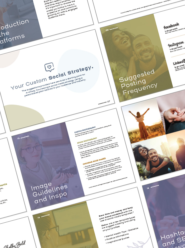
Once the new name was finalized, addressing the brand colors, logo, and messaging was next up. As part of the process, the tagline “Be seen. Be heard. Be you.” was chosen to peel back the curtains and help convey what to expect from Archway as a client.
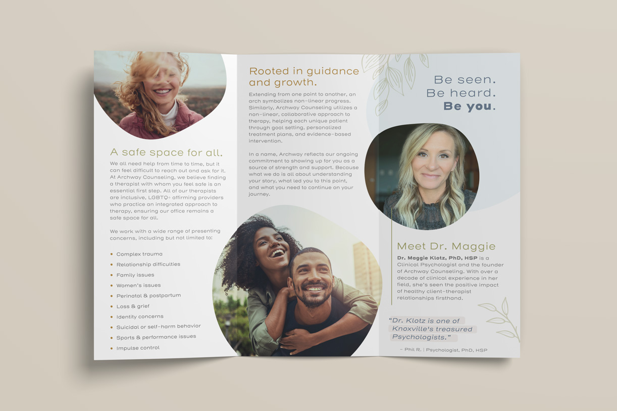
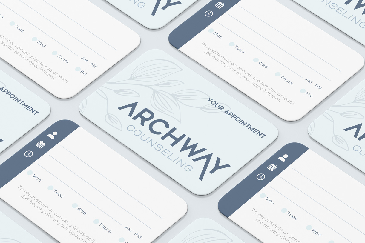
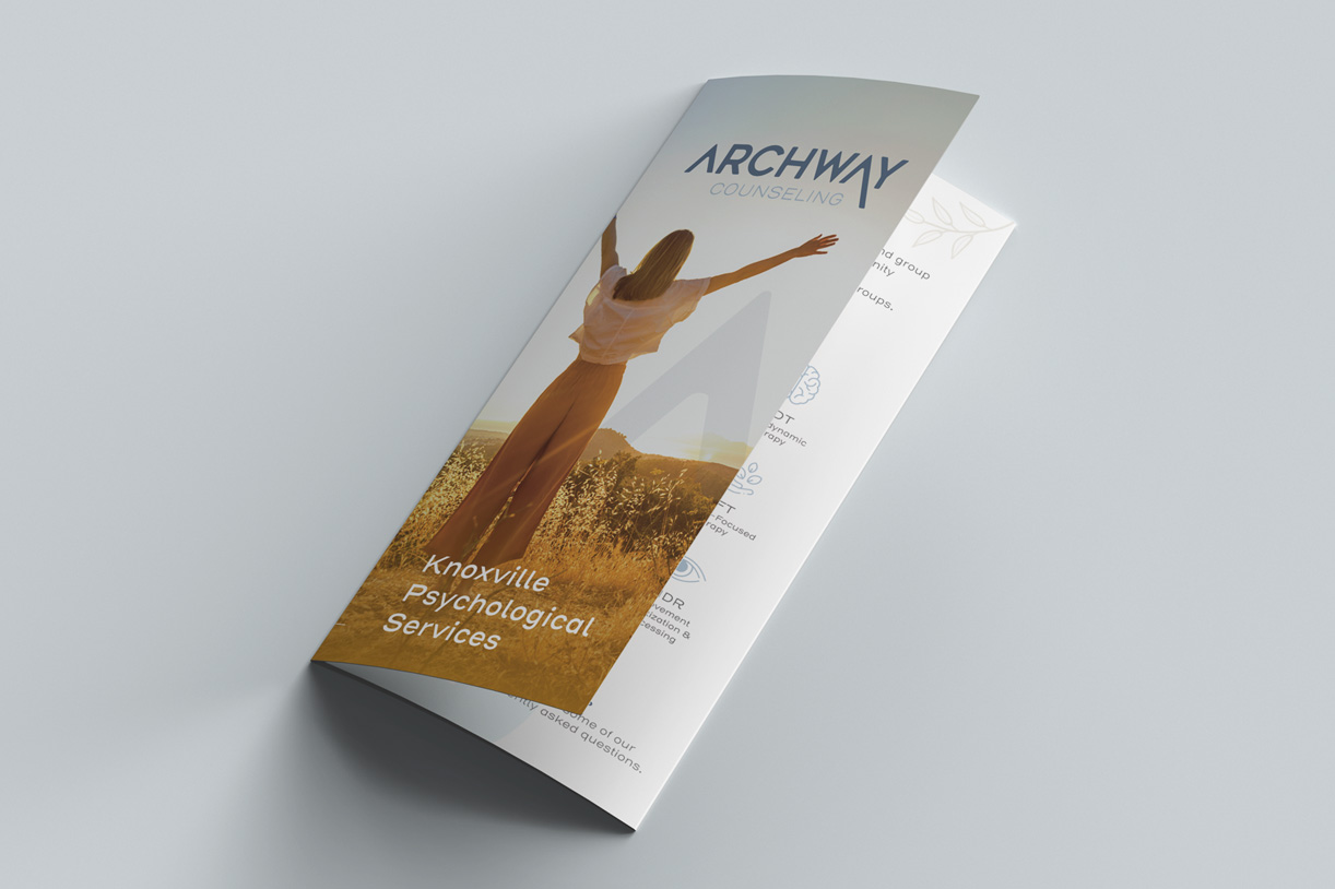
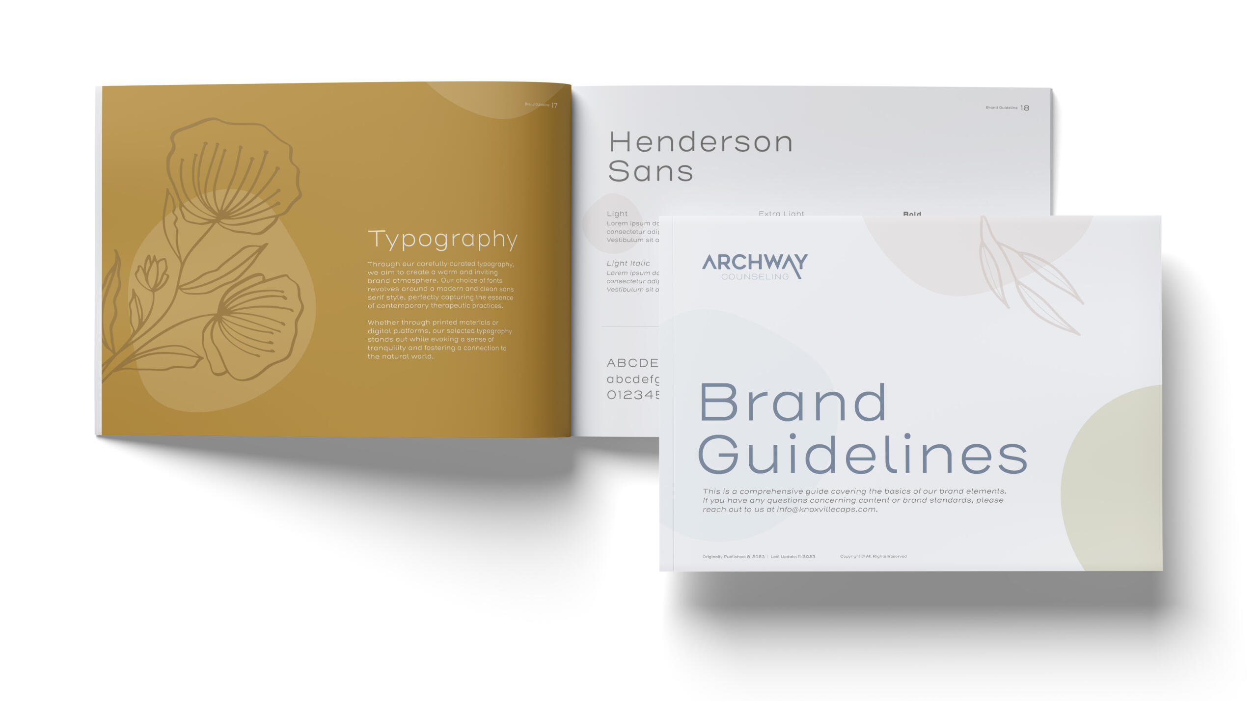
Next, we developed an earthy color palette using cool, neutral tones, followed by a modern logo with soft, rounded corners to visually represent both an arch and the geographic area. With all new brand elements in place, we proceeded to develop fresh brand assets, including a brochure, business cards, and style guide, as well as a strategic launch plan to help Dr. Klotz seamlessly introduce the new brand to clients and the community.
“Working with Asen absolutely transformed my counseling private practice! Thanks to their guidance, I have seen increased growth and engagement in the practice and I feel proud every time I hand out my new marketing materials. I could not recommend Asen more!”